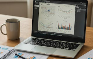
In this hands-on project, we will understand the fundamentals of data visualization with Python and leverage the power of two important python libraries known as Matplotlib and seaborn. We will learn how to generate line plots, scatterplots, histograms, distribution plot, 3D plots, pie charts, pair plots, countplots and many more!
Python for Data Visualization: Matplotlib & Seaborn
Python for Data Visualization: Matplotlib & Seaborn

位教师:Ryan Ahmed
访问权限由 New York State Department of Labor 提供
6,309 人已注册
您将学到什么
Understand python programming fundamentals for data visualization
Leverage the power of Matplotlib and Seaborn
Plot histograms, countplots, scatterplots, and line plots
您将练习的技能
您将使用的工具
要了解的详细信息

可分享的证书
添加到您的领英档案
授课语言:英语(English)
无需下载或安装
仅桌面可用
了解顶级公司的员工如何掌握热门技能

在 2 小时内学习、练习并应用岗位必备技能
- 接受行业专家的培训
- 获得解决实训工作任务的实践经验
- 使用最新的工具和技术来建立信心

关于此指导项目
分步进行学习
在与您的工作区一起在分屏中播放的视频中,您的授课教师将指导您完成每个步骤:
Task #1: Plot basic Line Plots
Task #2: Plot Scatterplot
Task #3: Plot pie charts
Task #4: Plot Histograms
Task #5: Plot Multiple Plots
Task #6: Plot Subplots
Task #7: Plot 3D Plots
Task #8: Plot Scatterplot & Count plot (Seaborn)
Task #9: Plot Pairplot, Distplot, and Heatmaps (Seaborn)
推荐体验
Basic python programming and mathematics.
8个项目图片
位教师
授课教师评分
(8个评价)38 门课程120,617 名学生
提供方
学习方式
基于技能的实践学习
通过完成与工作相关的任务来练习新技能。
专家指导
使用独特的并排界面,按照预先录制的专家视频操作。
无需下载或安装
在预配置的云工作空间中访问所需的工具和资源。
仅在台式计算机上可用
此指导项目专为具有可靠互联网连接的笔记本电脑或台式计算机而设计,而不是移动设备。
人们为什么选择 Coursera 来帮助自己实现职业发展

Felipe M.
自 2018开始学习的学生
''能够按照自己的速度和节奏学习课程是一次很棒的经历。只要符合自己的时间表和心情,我就可以学习。'

Jennifer J.
自 2020开始学习的学生
''我直接将从课程中学到的概念和技能应用到一个令人兴奋的新工作项目中。'

Larry W.
自 2021开始学习的学生
''如果我的大学不提供我需要的主题课程,Coursera 便是最好的去处之一。'

Chaitanya A.
''学习不仅仅是在工作中做的更好:它远不止于此。Coursera 让我无限制地学习。'
学生评论
- 5 stars
70.51%
- 4 stars
23.07%
- 3 stars
5.12%
- 2 stars
1.28%
- 1 star
0%
显示 3/78 个
WJ
已于 Jan 16, 2026审阅
It was a great hands on learning project. I highly recommmend for those looking to practice on real world data appliation or refreshing their skills. Thanks to the course team and coursera.
LA
已于 Sep 11, 2021审阅
I liked the concise (not replete) course delivery. I would suggest thought that the exercises be conducted using Colab instead of the built-in Ryder.
TG
已于 Jan 26, 2022审阅
It is so useful and very well structured and explained.