
Unlock the power of data visualization and analysis with Excel! In this course, you will learn how to create various types of charts and pivot tables to turn raw data into actionable insights. From basic column and pie charts to complex combination and gauge charts, you’ll gain the skills to represent data visually in a way that tells a compelling story. As you progress, you will also master pivot tables, including techniques for grouping, filtering, and creating multi-level data analysis to enhance your decision-making.

Excel Charts and Pivot Tables
抓住节省的机会!购买 Coursera Plus 3 个月课程可享受40% 的折扣,并可完全访问数千门课程。

您将学到什么
Learn how to create and customize various types of charts in Excel to represent data effectively.
Master pivot tables to analyze and summarize large datasets for deeper insights.
Develop skills in creating advanced data visualizations like combination charts and gauge charts.
Understand how to add trendlines, error bars, and sparklines to enhance your Excel charts.
您将学习的工具
要了解的详细信息

可分享的证书
添加到您的领英档案
最近已更新!
January 2026
作业
3 项作业
授课语言:英语(English)
了解顶级公司的员工如何掌握热门技能


从 Data Analysis 浏览更多内容
 状态:免费试用
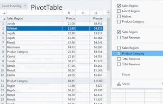 状态:免费试用
 状态:免费试用
 状态:免费试用
人们为什么选择 Coursera 来帮助自己实现职业发展

Felipe M.
自 2018开始学习的学生
''能够按照自己的速度和节奏学习课程是一次很棒的经历。只要符合自己的时间表和心情,我就可以学习。'

Jennifer J.
自 2020开始学习的学生
''我直接将从课程中学到的概念和技能应用到一个令人兴奋的新工作项目中。'

Larry W.
自 2021开始学习的学生
''如果我的大学不提供我需要的主题课程,Coursera 便是最好的去处之一。'

Chaitanya A.
''学习不仅仅是在工作中做的更好:它远不止于此。Coursera 让我无限制地学习。'
