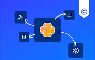
University of Colorado Boulder
BiteSize Python: Data Visualization
University of Colorado Boulder

BiteSize Python: Data Visualization

Di Wu

位教师:Di Wu

包含在 Coursera Plus

深入了解一个主题并学习基础知识。
中级 等级

推荐体验

2 周 完成
在 10 小时 一周
灵活的计划
自行安排学习进度
深入了解一个主题并学习基础知识。
中级 等级

推荐体验

2 周 完成
在 10 小时 一周
灵活的计划
自行安排学习进度

您将学到什么

  • Identify the strengths and differences between Matplotlib, Seaborn, and Plotly for various visualization needs.

  • Create a wide range of plots, including line, bar, scatter, and pie charts, using each of the three packages.

  • Apply data visualization techniques to real-world data, gaining deeper insights into how to use these tools for storytelling and communication.

要了解的详细信息

可分享的证书

添加到您的领英档案

作业

4 项作业

授课语言:英语(English)

了解顶级公司的员工如何掌握热门技能

Petrobras, TATA, Danone, Capgemini, P&G 和 L'Oreal 的徽标

积累特定领域的专业知识

本课程是 BiteSize Python for Intermediate Learners 专项课程 专项课程的一部分
在注册此课程时,您还会同时注册此专项课程。
  • 向行业专家学习新概念
  • 获得对主题或工具的基础理解
  • 通过实践项目培养工作相关技能
  • 获得可共享的职业证书

该课程共有5个模块

This module introduces the fundamentals of the Matplotlib package, a powerful and versatile library for creating static, animated, and interactive visualizations in Python. It begins with a brief overview of Matplotlib and demonstrates how to create a simple plot. Learners will explore how to enhance visualizations by adding titles, labels, and legends, as well as how to customize the plot’s appearance with different styles, lines, and markers. Additionally, the module covers adding annotations for clarity and how to create subplots to display multiple graphs within a single figure. By the end, students will be equipped with essential plotting skills using Matplotlib.

涵盖的内容

5篇阅读材料1个作业6个非评分实验室

This module expands on the basic features of Matplotlib, guiding learners through the creation of a variety of complex plots that are essential for advanced data visualization. Starting with line, bar, and histogram plots, the module also covers scatter plots, pie charts, box plots, heatmaps, and how to manage complex subplots. These visualizations are crucial for effectively communicating patterns and insights from different types of data. By mastering these plots, students will be able to visualize complex datasets in a way that facilitates data analysis and decision-making.

涵盖的内容

1篇阅读材料1个作业8个非评分实验室

In this module, students will apply the skills learned from both the Basic and Advanced Matplotlib modules by working with the "Economy of Us" dataset. This case study challenges learners to create a variety of plots to visualize the dataset effectively. By generating multiple types of visualizations—such as line, bar, scatter, and heatmap plots—students will practice their ability to present economic data in a meaningful way. This hands-on experience reinforces key concepts and helps students solidify their understanding of Matplotlib for real-world applications.

涵盖的内容

1篇阅读材料8个非评分实验室

This module introduces Seaborn, a powerful Python visualization library built on top of Matplotlib that simplifies the creation of attractive and informative statistical graphics. Students will learn how to create various types of plots, including relational plots, distribution plots, and categorical plots, which are crucial for analyzing relationships between variables, distributions, and categories. The module also covers how to enhance visualizations by adding colors, styles, and facets for better data interpretation. Additionally, students will explore the lmplot function for fitting regression models and learn to generate multiple plots for comprehensive data analysis.

涵盖的内容

2篇阅读材料1个作业10个非评分实验室

This module introduces students to Plotly, a powerful data visualization library that enables the creation of interactive and dynamic visualizations. The module begins with an overview of what Plotly is and its advantages for data visualization. Students will learn how to create various types of plots, including scatter, line, area, bar, timeline, funnel, pie, and histogram plots. Additionally, the module will cover advanced techniques for creating 3D visualizations, such as 3D scatter plots and 3D line plots, providing learners with the skills to develop engaging and informative visual content.

涵盖的内容

2篇阅读材料1个作业12个非评分实验室

获得职业证书

将此证书添加到您的 LinkedIn 个人资料、简历或履历中。在社交媒体和绩效考核中分享。

位教师

Di Wu
University of Colorado Boulder
21 门课程53,729 名学生

提供方

从 Data Analysis 浏览更多内容

人们为什么选择 Coursera 来帮助自己实现职业发展

Felipe M.
自 2018开始学习的学生
''能够按照自己的速度和节奏学习课程是一次很棒的经历。只要符合自己的时间表和心情,我就可以学习。'
Jennifer J.
自 2020开始学习的学生
''我直接将从课程中学到的概念和技能应用到一个令人兴奋的新工作项目中。'
Larry W.
自 2021开始学习的学生
''如果我的大学不提供我需要的主题课程,Coursera 便是最好的去处之一。'
Chaitanya A.
''学习不仅仅是在工作中做的更好:它远不止于此。Coursera 让我无限制地学习。'
Coursera Plus

通过 Coursera Plus 开启新生涯

无限制访问 10,000+ 世界一流的课程、实践项目和就业就绪证书课程 - 所有这些都包含在您的订阅中

通过在线学位推动您的职业生涯

获取世界一流大学的学位 - 100% 在线

加入超过 3400 家选择 Coursera for Business 的全球公司

提升员工的技能,使其在数字经济中脱颖而出

常见问题