
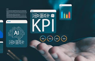
Are your financial reports being ignored? In a world saturated with data, complexity is the enemy of impact. This course, Visualize & Evaluate Financial Performance Reports, is an intermediate-to-advanced program for financial analysts, accountants, and business leaders who need to do more than just present data—they need to drive decisions. You will move beyond basic chart-making and learn a powerful, repeatable framework for transforming raw P&L data into high-impact, one-page visual snapshots that stakeholders can understand in seconds.
Visualize & Evaluate Financial Performance Reports
Visualize & Evaluate Financial Performance Reports
本课程是多个项目的一部分。

位教师:LearningMate
访问权限由 New York State Department of Labor 提供
您将学到什么
Translate raw financial data into clear, high-impact visual reports and validate their effectiveness using rapid-interpretation tests.
要了解的详细信息
了解顶级公司的员工如何掌握热门技能

积累特定领域的专业知识
此课程作为 的一部分提供
在注册此课程时,您还需要选择一个特定的合作项目。
- 向行业专家学习新概念
- 获得对主题或工具的基础理解
- 通过实践项目培养工作相关技能
- 获得可共享的职业证书

该课程共有3个模块
获得职业证书
将此证书添加到您的 LinkedIn 个人资料、简历或履历中。在社交媒体和绩效考核中分享。
位教师
274 门课程20,770 名学生
提供方
人们为什么选择 Coursera 来帮助自己实现职业发展

Felipe M.
自 2018开始学习的学生
''能够按照自己的速度和节奏学习课程是一次很棒的经历。只要符合自己的时间表和心情,我就可以学习。'

Jennifer J.
自 2020开始学习的学生
''我直接将从课程中学到的概念和技能应用到一个令人兴奋的新工作项目中。'

Larry W.
自 2021开始学习的学生
''如果我的大学不提供我需要的主题课程,Coursera 便是最好的去处之一。'

Chaitanya A.
''学习不仅仅是在工作中做的更好:它远不止于此。Coursera 让我无限制地学习。'
从 Business 浏览更多内容


¹ 本课程的部分作业采用 AI 评分。对于这些作业,将根据 Coursera 隐私声明使用您的数据。