Unlock the power of data visualization and analysis with Excel! In this course, you will learn how to create various types of charts and pivot tables to turn raw data into actionable insights. From basic column and pie charts to complex combination and gauge charts, you’ll gain the skills to represent data visually in a way that tells a compelling story. As you progress, you will also master pivot tables, including techniques for grouping, filtering, and creating multi-level data analysis to enhance your decision-making.

Excel Charts and Pivot Tables

Obtenez un aperçu d'un sujet et apprenez les principes fondamentaux.
niveau Intermédiaire
Expérience recommandée
2 heures à compléter
Planning flexible
Apprenez à votre propre rythme
Ce que vous apprendrez
Learn how to create and customize various types of charts in Excel to represent data effectively.
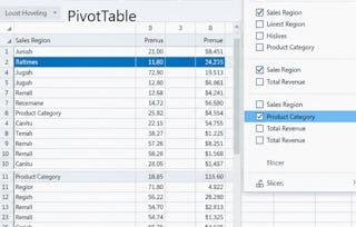
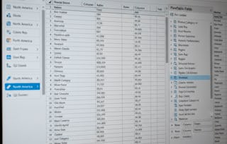
Master pivot tables to analyze and summarize large datasets for deeper insights.
Develop skills in creating advanced data visualizations like combination charts and gauge charts.
Understand how to add trendlines, error bars, and sparklines to enhance your Excel charts.
Compétences que vous acquerrez
- Catégorie : Plot (Graphics)
- Catégorie : Data Visualization
- Catégorie : Spreadsheet Software
- Catégorie : Data Management
Détails à connaître

Certificat partageable
Ajouter à votre profil LinkedIn
Récemment mis à jour !
janvier 2026
Évaluations
3 devoirs
Enseigné en Anglais
Découvrez comment les employés des entreprises prestigieuses maîtrisent des compétences recherchées

Il y a 2 modules dans ce cours
Instructeur

Offert par


En savoir plus sur Data Analysis


Pour quelles raisons les étudiants sur Coursera nous choisissent-ils pour leur carrière ?

Felipe M.
Étudiant(e) depuis 2018
’Pouvoir suivre des cours à mon rythme à été une expérience extraordinaire. Je peux apprendre chaque fois que mon emploi du temps me le permet et en fonction de mon humeur.’

Jennifer J.
Étudiant(e) depuis 2020
’J'ai directement appliqué les concepts et les compétences que j'ai appris de mes cours à un nouveau projet passionnant au travail.’

Larry W.
Étudiant(e) depuis 2021
’Lorsque j'ai besoin de cours sur des sujets que mon université ne propose pas, Coursera est l'un des meilleurs endroits où se rendre.’

Chaitanya A.
’Apprendre, ce n'est pas seulement s'améliorer dans son travail : c'est bien plus que cela. Coursera me permet d'apprendre sans limites.’

Ouvrez de nouvelles portes avec Coursera Plus
Accès illimité à 10,000+ cours de niveau international, projets pratiques et programmes de certification prêts à l'emploi - tous inclus dans votre abonnement.
Faites progresser votre carrière avec un diplôme en ligne
Obtenez un diplôme auprès d’universités de renommée mondiale - 100 % en ligne
Rejoignez plus de 3 400 entreprises mondiales qui ont choisi Coursera pour les affaires
Améliorez les compétences de vos employés pour exceller dans l’économie numérique
Foire Aux Questions
Plus de questions
Aide financière disponible,